
Creating charts and infographics can be time-consuming. But these tools make it easier.
It's often said that data is the new world currency, and the web is the exchange bureau through which it's traded. As consumers, we're positively swimming in data; it's everywhere from labels on food packaging design to World Health Organisation reports. As a result, for the designer it's becoming increasingly difficult to present data in a way that stands out from the mass of competing data streams.
One of the best ways to get your message across is to use a visualization to quickly draw attention to the key messages, and by presenting data visually it's also possible to uncover surprising patterns and observations that wouldn't be apparent from looking at stats alone.
Not a web designer or developer? You may prefer free tools for creating infographics.
As author, data journalist and information designer David McCandless said in his TED talk: "By visualizing information, we turn it into a landscape that you can explore with your eyes, a sort of information map. And when you're lost in information, an information map is kind of useful."
There are many different ways of telling a story, but everything starts with an idea. So to help you get started we've rounded up some of the most awesome data visualization tools available on the web.
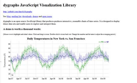
01. Dygraphs

Dygraphs is a fast, flexible open source JavaScript charting library that allows users to explore and interpret dense data sets. It's highly customizable, works in all major browsers, and you can even pinch to zoom on mobile and tablet devices.
02. ZingChart

ZingChart is a JavaScript charting library and feature-rich API set that lets you build interactive Flash or HTML5 charts. It offer over 100 chart types to fit your data.
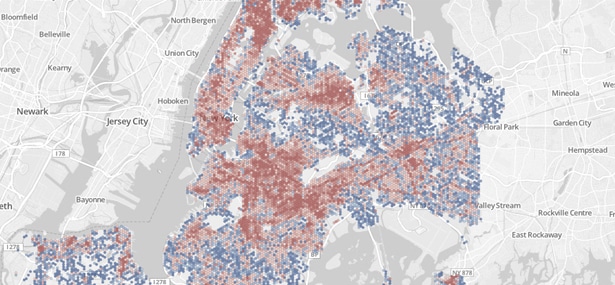
03. InstantAtlas

If you're looking for a data viz tool with mapping, InstantAtlas is worth checking out. This tool enables you to create highly-interactive dynamic and profile reports that combine statistics and map data to create engaging data visualizations.
04. Timeline
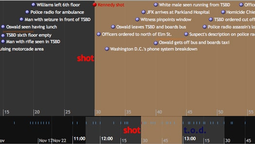
Timeline is a fantastic widget which renders a beautiful interactive timeline that responds to the user's mouse, making it easy to create advanced timelines that convey a lot of information in a compressed space.
Each element can be clicked to reveal more in-depth information, making this a great way to give a big-picture view while still providing full detail.
05. Exhibit
Developed by MIT, and fully open-source, Exhibit makes it easy to create interactive maps, and other data-based visualizations that are orientated towards teaching or static/historical based data sets, such as flags pinned to countries, or birth-places of famous people.
06. Modest Maps
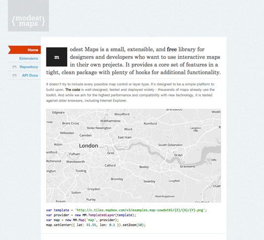
Modest Maps is a lightweight, simple mapping tool for web designers that makes it easy to integrate and develop interactive maps within your site, using them as a data visualization tool.
The API is easy to get to grips with, and offers a useful number of hooks for adding your own interaction code, making it a good choice for designers looking to fully customise their user's experience to match their website or web app. The basic library can also be extended with additional plugins, adding to its core functionality and offering some very useful data integration options.
07. Leaflet
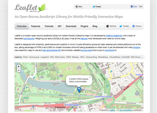
Another mapping tool, Leaflet makes it easy to use OpenStreetMap data and integrate fully interactive data visualisation in an HTML5/CSS3 wrapper.
The core library itself is very small, but there are a wide range of plugins available that extend the functionality with specialist functionality such as animated markers, masks and heatmaps. Perfect for any project where you need to show data overlaid on a geographical projection (including unusual projections!).
08. WolframAlpha
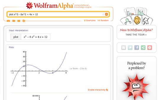
Billed as a "computational knowledge engine", the Google rival WolframAlpha is really good at intelligently displaying charts in response to data queries without the need for any configuration. If you're using publically available data, this offers a simple widget builder to make it really simple to get visualizations on your site.
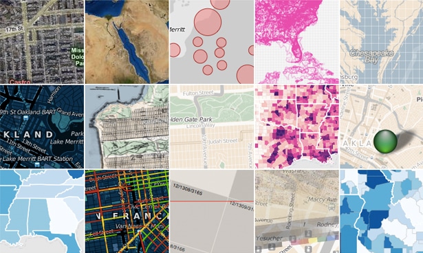
09. Visual.ly
Visual.ly is a combined gallery and infographic generation tool. It offers a simple toolset for building stunning data representations, as well as a platform to share your creations. This goes beyond pure data visualisation, but if you want to create something that stands on its own, it's a fantastic resource and an info-junkie's dream come true!
10. Visualize Free
Visualize Free is a hosted tool that allows you to use publicly available datasets, or upload your own, and build interactive visualizations to illustrate the data. The visualizations go well beyond simple charts, and the service is completely free plus while development work requires Flash, output can be done through HTML5.
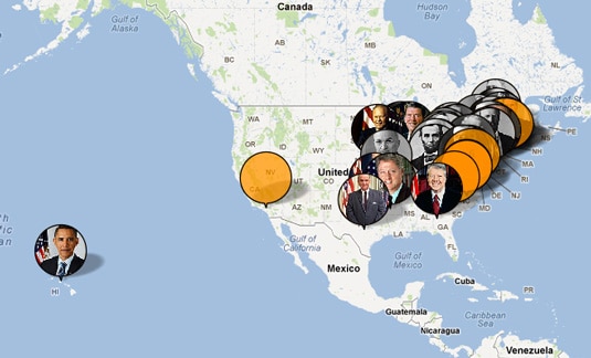
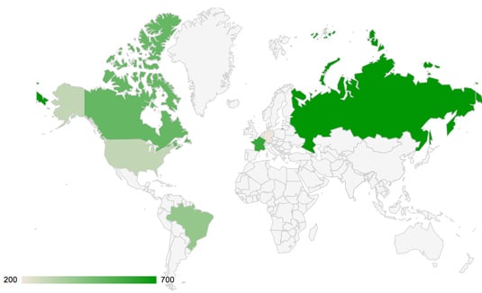
11. Better World Flux
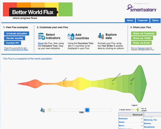
Orientated towards making positive change to the world, Better World Flux has some lovely visualizations of some pretty depressing data. It would be very useful, for example, if you were writing an article about world poverty, child undernourishment or access to clean water. This tool doesn't allow you to upload your own data, but does offer a rich interactive output.
12. FusionCharts
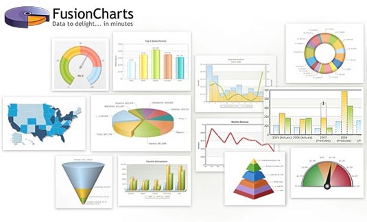
FusionCharts Suite XT brings you 90 charts and gauges, 965 data-driven maps, and ready-made business dashboards and demos. FusionCharts comes with extensive JavaScript API that makes it easy to integrate it with any AJAX application or JavaScript framework. These charts, maps and dashboards are highly interactive, customizable and work across all devices and platforms. They also have a comparison of the top JavaScript charting libraries which is worth checking out.
13. jqPlot
Another jQuery plugin, jqPlot is a nice solution for line and point charts. It comes with a few nice additional features such as the ability to generate trend lines automatically, and interactive points that can be adjusted by the website visitor, updating the dataset accordingly.
14. Dipity
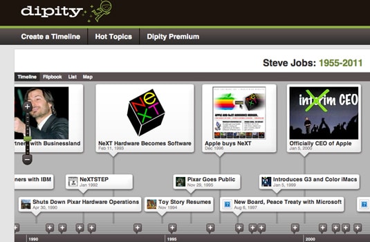
Dipity allows you to create rich interactive timelines and embed them on your website. It offers a free version and a premium product, with the usual restrictions and limitations present. The timelines it outputs are beautiful and fully customisable, and are very easy to embed directly into your page.
15. Many Eyes
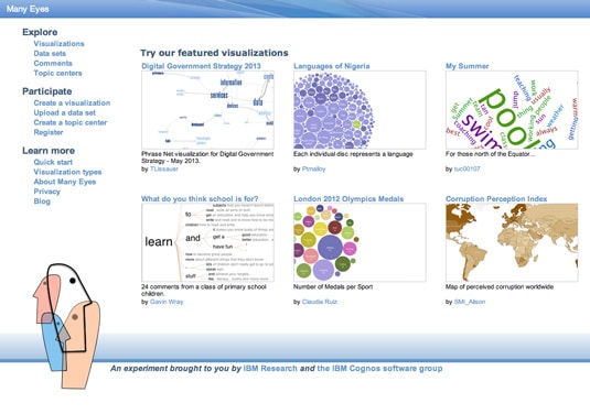
Developed by IBM, Many Eyes allows you to quickly build visualizations from publically available or uploaded data sets, and features a wide range of analysis types including the ability to scan text for keyword density and saturation. This is another great example of a big company supporting research and sharing the results openly.
16. D3.js
D3.js is a JavaScript library that uses HTML, SVG, and CSS to render some amazing diagrams and charts from a variety of data sources. This library, more than most, is capable of some seriously advanced visualizations with complex data sets. It's open source, and uses web standards so is very accessible. It also includes some fantastic user interaction support.
17. JavaScript InfoVis Toolkit
A fantastic library written by Nicolas Belmonte, the JavaScript InfoVis Toolkit includes a modular structure, allowing you to only force visitors to download what's absolutely necessary to display your chosen data visualizations. This library has a number of unique styles and swish animation effects, and is free to use (although donations are encouraged).
18. jpGraph
If you need to generate charts and graphs server-side, jpGraph offers a PHP-based solution with a wide range of chart types. It's free for non-commercial use, and features extensive documentation. By rendering on the server, this is guaranteed to provide a consistent visual output, albeit at the expense of interactivity and accessibility.
19. Highcharts
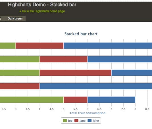
Highcharts is a JavaScript charting library with a huge range of chart options available. The output is rendered using SVG in modern browsers and VML in Internet Explorer. The charts are beautifully animated into view automatically, and the framework also supports live data streams. It's free to download and use non-commercially (and licensable for commercial use). You can also play with the extensive demos using JSFiddle.
20. Google Charts
The seminal charting solution for much of the web, Google Charts is highly flexible and has an excellent set of developer tools behind it. It's an especially useful tool for specialist visualizations such as geocharts and gauges, and it also includes built-in animation and user interaction controls.
21. Excel
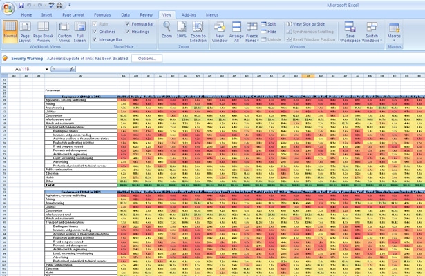
You can actually do some pretty complex things with Excel, from 'heat maps' of cells to scatter plots. As an entry-level tool, it can be a good way of quickly exploring data, or creating visualizations for internal use, but the limited default set of colours, lines and styles make it difficult to create graphics that would be usable in a professional publication or website. Nevertheless, as a means of rapidly communicating ideas, Excel should be part of your toolbox.
Excel comes as part of the commercial Microsoft Office suite, so if you don't have access to it, Google's spreadsheets - part ofGoogle Docs and Google Drive - can do many of the same things. Google 'eats its own dog food', so the spreadsheet can generate the same charts as the Google Chart API. This will get your familiar with what is possible before stepping off and using the API directly for your own projects.
22. CSV/JSON
CSV (Comma-Separated Values) and JSON (JavaScript Object Notation) aren't actual visualization tools, but they are common formats for data. You'll need to understand their structures and how to get data in or out of them.
23. Crossfilter
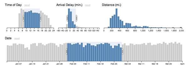
As we build more complex tools to enable clients to wade through their data, we are starting to create graphs and charts that double as interactive GUI widgets. JavaScript library Crossfilter can be both of these. It displays data, but at the same time, you can restrict the range of that data and see other linked charts react.
24. Tangle
The line between content and control blurs even further with Tangle. When you are trying to describe a complex interaction or equation, letting the reader tweak the input values and see the outcome for themselves provides both a sense of control and a powerful way to explore data. JavaScript library Tangle is a set of tools to do just this.
Dragging on variables enables you to increase or decrease their values and see an accompanying chart update automatically. The results are only just short of magical.
25. Polymaps
Polymaps is a mapping library that is aimed squarely at a data visualization audience. Offering a unique approach to styling the the maps it creates, analagous to CSS selectors, it's a great resource to know about.
26. OpenLayers
OpenLayers is probably the most robust of these mapping libraries. The documentation isn't great and the learning curve is steep, but for certain tasks nothing else can compete. When you need a very specific tool no other library provides, OpenLayers is always there.
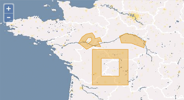
27. Kartograph
Kartograph's tag line is 'rethink mapping' and that is exactly what its developers are doing. We're all used to the Mercator projection, but Kartograph brings far more choices to the table. If you aren't working with worldwide data, and can place your map in a defined box, Kartograph has the options you need to stand out from the crowd.
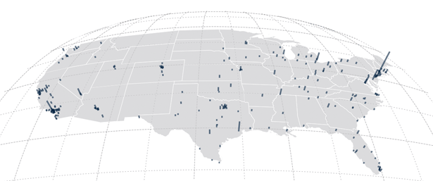
28. CartoDB
CartoDB is a must-know site. The ease with which you can combine tabular data with maps is second to none. For example, you can feed in a CSV file of address strings and it will convert them to latitudes and longitudes and plot them on a map, but there are many other users. It's free for up to five tables; after that, there are monthly pricing plans.
29. Processing

Processing has become the poster child for interactive visualizations. It enables you to write much simpler code which is in turn compiled into Java.
There is also a Processing.js project to make it easier for websites to use Processing without Java applets, plus a port to Objective-C so you can use it on iOS. It is a desktop application, but can be run on all platforms, and given that it is now several years old, there are plenty of examples and code from the community.
30. NodeBox
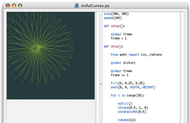
NodeBox is an OS X application for creating 2D graphics and visualizations. You need to know and understand Python code, but beyond that it's a quick and easy way to tweak variables and see results instantly. It's similar to Processing, but without all the interactivity.
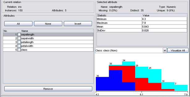
31. R
How many other pieces of software have an entire search enginededicated to them? A statistical package used to parse large data sets, R is a very complex tool, and one that takes a while to understand, but has a strong community and package library, with more and more being produced.
The learning curve is one of the steepest of any of these tools listed here, but you must be comfortable using it if you want to get to this level.
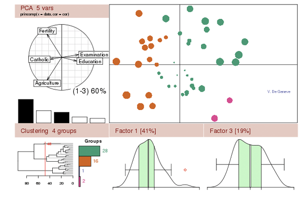
32. Weka
When you get deeper into being a data scientist, you will need to expand your capabilities from just creating visualizations to data mining. Weka is a good tool for classifying and clustering data based on various attributes - both powerful ways to explore data - but it also has the ability to generate simple plots.
33. Gephi
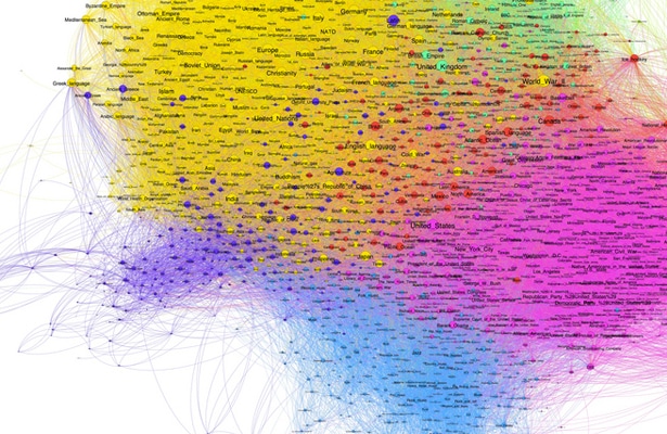
When people talk about relatedness, social graphs and co-relations, they are really talking about how two nodes are related to one another relative to the other nodes in a network. The nodes in question could be people in a company, words in a document or passes in a football game, but the maths is the same.
Gephi, a graph-based visualiser and data explorer, can not only crunch large data sets and produce beautiful visualizations, but also allows you to clean and sort the data. It's a very niche use case and a complex piece of software, but it puts you ahead of anyone else in the field who doesn't know about this gem.
34. iCharts
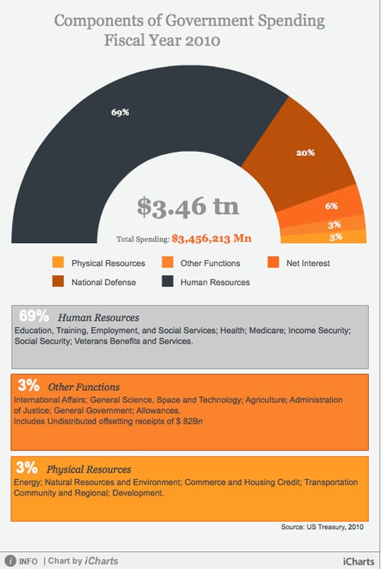
The iCharts service provides a hosted solution for creating and presenting compelling charts for inclusion on your website. There are many different chart types available, and each is fully customisable to suit the subject matter and colour scheme of your site.
Charts can have interactive elements, and can pull data from Google Docs, Excel spreadsheets and other sources. The free account lets you create basic charts, while you can pay to upgrade for additional features and branding-free options.
35. Flot
Flot is a specialised plotting library for jQuery, but it has many handy features and crucially works across all common browsers including Internet Explorer 6. Data can be animated and, because it's a jQuery plugin, you can fully control all the aspects of animation, presentation and user interaction. This does mean that you need to be familiar with (and comfortable with) jQuery, but if that's the case, this makes a great option for including interactive charts on your website.
36. Raphaël
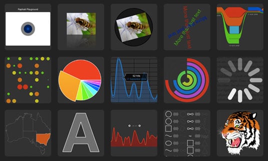
This handy JavaScript library offers a wide range of data visualization options which are rendered using SVG. This makes for a flexible approach that can easily be integrated within your own web site/app code, and is limited only by your own imagination.
That said, it's a bit more hands-on than some of the other tools featured here (a victim of being so flexible), so unless you're a hardcore coder, you might want to check out some of the more point-and-click orientated options first!
37. jQuery Visualize
Written by the team behind jQuery's ThemeRoller and jQuery UI websites, jQuery Visualize Plugin is an open source charting plugin for jQuery that uses HTML Canvas to draw a number of different chart types. One of the key features of this plugin is its focus on achieving ARIA support, making it friendly to screen-readers. It's free to download from this page on GitHub.


3 thoughts on “The 37 Best Tools For Data Visualization”
Awesome Charts but for students it should be free . But no any community is providing in free . All are taking money .
Also consider GIS Chart (gischart.com)
What about Datazen?