When Did Charts Become Popular?
- by 7wData
Modern newspapers are overflowing with charts. The New York Times, Washington Post and Wall Street Journal dedicate immense resources to making graphics for both their print and online editions.
But it was not always so.
The New York Times was first published in 1851. From nearly the beginning of its existence, the Times brimmed with data like stock prices, weather statistics, and sports scores. But for the first century of publication, the use of charts to display that data was rare.
In order to understand when charts started appearing in papers, we collected data on the number of charts in editions of the New York Times over its history. We checked a weekday, September edition of the paper every five years from 1855 to 2015. We chose the Times because of its rich archives and because we found it to be representative of trends in the newspaper industry.
Though statistical graphics were already in fairly common use by the turn of the 19th Century, the pre-1930 editions we examined had exactly zero charts. Every paper since 1930 has had at least one Chart, and the 2010 and 2015 editions each included more than twenty.
The Chart is now accepted as an integral tool for journalism. What took so long?
The Dark Ages (1930 and Before)
The modern statistical chart was invented by the Scottish political economist William Playfair at the end of the 18th Century. In a fit of astonishing innovation from 1786 to 1801, Playfair made the first known bar chart, line chart, and pie chart.
Historians believe that Playfair’s development of the statistical chart was a response to the surge in the availability of economic and demographic data collected by governments. Suddenly, efficient ways to express all this information were necessary. The chart filled that need.
Playfair’s data visualizations did not quickly catch on. They were initially considered childish by serious academics.
The use of statistical graphics did not proliferate in Playfair’s lifetime—he died in 1823. But by the beginning of the 20th Century, graphical representations of data were common in textbooks and used by governments, financiers, and scientists. Both the French and American governments annually published statistical atlases filled with charts that aimed to explain the world.
Yet charts were nowhere to be seen in the newspaper.
There were lots of statistics in the paper. Journalists wrote about trends in the bond markets, activity in the commodity markets, and changing birth rates. Numbers were a big part of the media; they just weren’t visualized.
Given the vast amounts of data in the paper, why the rarity of charts?
There is little academic research on the subject, but the most likely explanation is a combination of technological hurdles and the public’s unfamiliarity with statistical graphics.
Making charts in the first half of the 20th Century meant hand drawing them—with a little help from primitive technology. Chart makers' main tools were rulers, graph paper, and compass pens. Journalists did not make charts without seriously considering whether it was worth the time.
When newspapers did choose to publish a chart, the average person might not understand it. Though data visualization was common in academia, government, and science, the average person was not accustomed to interpreting charts. Charts were still such a rarity in the early part of the 20th Century that in 1913 there was a “parade of statistical graphics” in New York City .
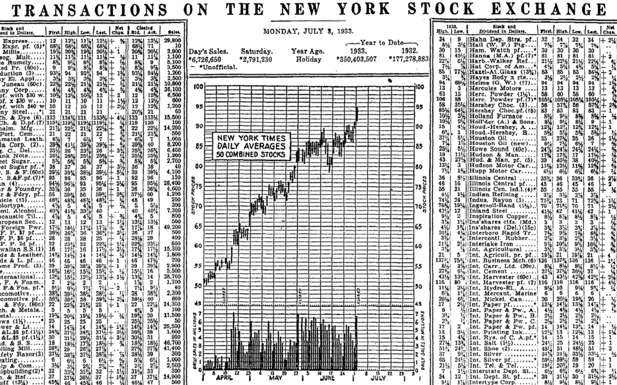
July 4, 1933, is arguably the day that data visualization became a permanent part of mainstream media.
On that day, with no fanfare, our analysis suggests that the New York Times published a stock market line chart for the very first time. A stock market line chart is that most famous of graphics that shows trends in the performance of an index of stocks over a given period.
Charts did appear in the Times prior to that day, but inconsistently. Some days the paper contained no charts at all.
[Social9_Share class=”s9-widget-wrapper”]
Upcoming Events
Evolving Your Data Architecture for Trustworthy Generative AI
18 April 2024
5 PM CET – 6 PM CET
Read MoreShift Difficult Problems Left with Graph Analysis on Streaming Data
29 April 2024
12 PM ET – 1 PM ET
Read More