What I learnt from creating The Data Visualisation Catalogue
- by 7wData
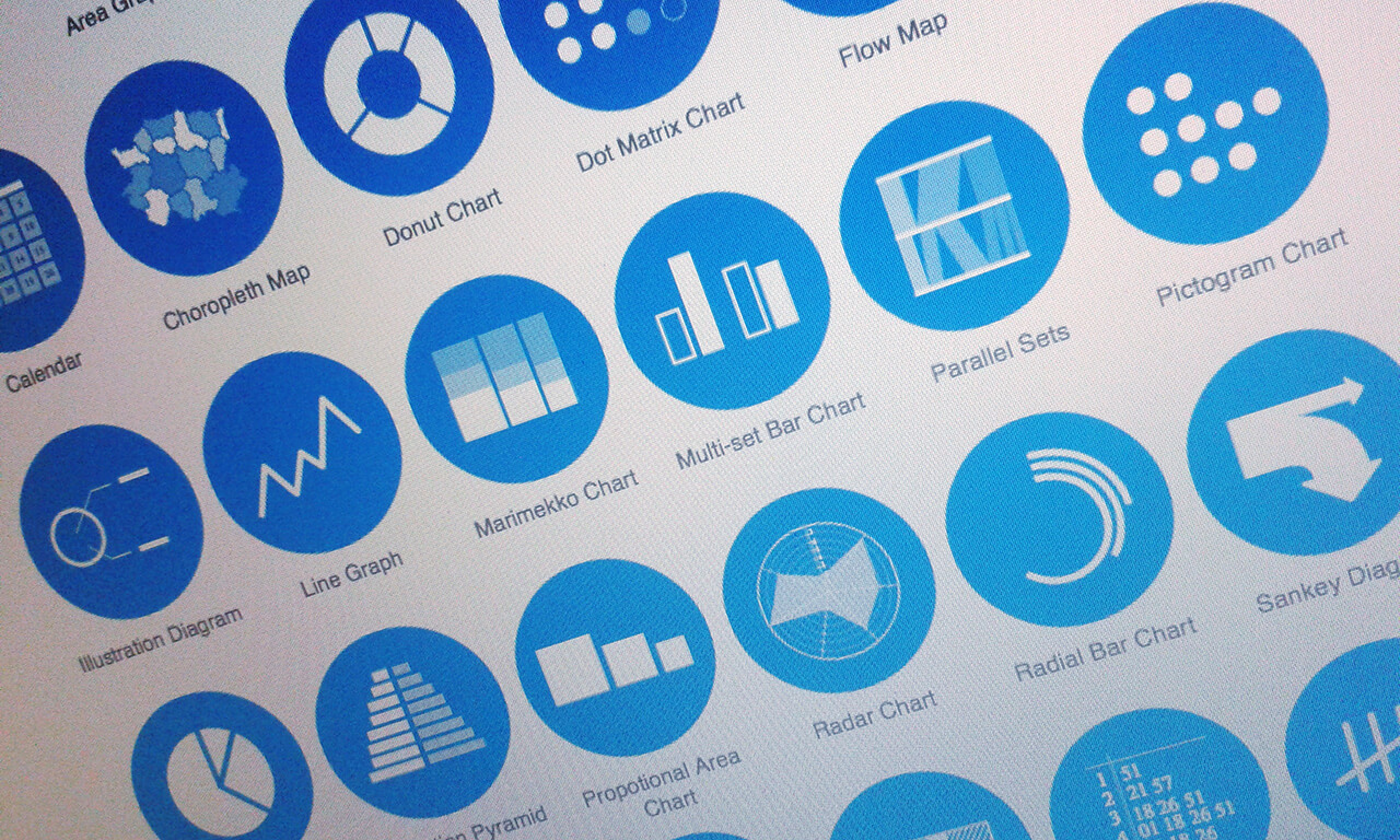
Before I started working on The data Visualisation Catalogue, my Chart toolbox was limited. I knew of only simple charts like a Bar Graph, Pie Chart, Pictogram Chart, Proportional Area Chart, et cetera. Y’know, the type of charts that fit well onto an infographic. However, this felt insufficient and I had strong urge to expand my knowledge of data visualisation.
Previously, I had studied information design, lightly touching on data visualisation, and I had already worked on a few infographic projects; but since I had only recently graduated from my Bachelors a couple of years ago, my knowledge was still at a “beginners” level when it came to data visualisation. I also wanted to expand my options when working with data and easily identify the best way to showcase my data.
In the past, the only guides I knew for selecting charts were Ralph Lengler’s and Martin J.Eppler’s A Periodic Table of Visualization Methods and Christian Behrens’ InfoDesignPatterns project (no longer online). However, I needed a reference tool of my own that I could adapt to suit my own needs.
So initially, I began by collecting a list of different chart types into a spreadsheet. This only included simple bits of data, such as photo of the chart, its common name and links to webpages with more information on it.
Eventually, once I had enough time to spare, I went about designing and developing a website based on the research I had.
But it was not enough to effectively describe how each chart works or why it’s useful.
I wanted to have some kind of system to help me select a chart, but my knowledge of what distinguished each chart from one another was limited. So I thought, for now I don’t have any overarching system to organise these charts into, but I do know that they all serve some kind of function. So for the time-being, I organised charts based on the functions they perform. It wasn’t a perfect system, but I thought that as I learnt more about data visualisation and each chart type individually, I would eventually develop a better system.
To build a solid understanding of each chart, how they’re constructed and what they’re useful for communicating, I would need to dig deeper.
I started to research further into each chart type I had recorded, using a number of online and print sources, to keep it as objective as possible. Some sources provided a good description of how the chart is drawn, while others might provide insight on how the chart is useful.
[Social9_Share class=”s9-widget-wrapper”]
Upcoming Events
Evolving Your Data Architecture for Trustworthy Generative AI
18 April 2024
5 PM CET – 6 PM CET
Read MoreShift Difficult Problems Left with Graph Analysis on Streaming Data
29 April 2024
12 PM ET – 1 PM ET
Read More