One Dataset, Visualized 25 Ways
- by 7wData
This is what happens when you let the data ramble.
“Let the data speak.” It’s a common saying for chart design. The premise — strip out the bits that don’t help patterns in your data emerge — is fine, but people often misinterpret the mantra to mean that they should make a stripped down chart and let the data take it from there.
You have to guide the conversation though. You must help the data focus and get to the point. Otherwise, it just ends up rambling about what it had for breakfast this morning and how the coffee wasn’t hot enough.
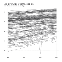
To show you what I mean, I present you with twenty-five charts below, all based on the same dataset. It’s life expectancy data by country, it’s from the the World Health Organization and it spans 2000 to 2015. Each chart provides a different focus and interpretation.
These are more sketches than they are finished graphics. There’s not much annotation, highlights, or explanations, and there isn’t any interaction. The geometry and visual encodings are straightforward. But you get the picture, right?
Data often has a lot — sometimes too much — to say.
What do you do when you have a lot of data? What if you don’t have a lot of time to poke at a dataset? How should you visualize your data? Here’s what you can do.
If you just let the data ramble, you have to pick out the interesting bits and filter out the unimportant ones. Sometimes this route is useful, especially when you don’t know what you’re dealing with. It’s kind of like listening in on a conversation or a roundtable.
Or, you can take the quicker route and ask questions to guide the conversation. This is more like an interview where you have specific ideas or concepts to look for.
[Social9_Share class=”s9-widget-wrapper”]
Upcoming Events
Evolving Your Data Architecture for Trustworthy Generative AI
18 April 2024
5 PM CET – 6 PM CET
Read MoreShift Difficult Problems Left with Graph Analysis on Streaming Data
29 April 2024
12 PM ET – 1 PM ET
Read More