Data with personality: the evolution of visualisation
- by 7wData
How well are financial institutions truly able to understand their data? It's a critical question at a time when firms must process more data than ever before, for both compliance and business growth
Financial markets data — and specifically investment data — comes in many guises. It can be structured or unstructured and contain multiple variables reflecting market conditions or the makeup of a product or portfolio.
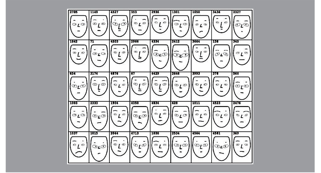
Its traits are fluid and difficult to pinpoint, similar perhaps to those of a human’s personality, which has infinite combinations. It’s an interesting comparison that shines new light on data visualisation.
Everybody is unique and has his or her own blend of characteristics to define who they are and how they might behave. Various methods have been introduced to categorise, understand and predict these traits, from Myers Briggs to horoscopes, and they’ve all brought order to unstructured information.
These approaches identify and define key characteristics, then provide an understanding of their spectrum and further explain how they translate to behaviours.
Essentially, they develop labels for people and rationalise behaviours to predict what they might do or the effect they might have on others. The strength lies in the rationalisation and understanding of what otherwise might seem like an endless and complex list of subjective personality traits.
But what if firms applied this approach in the financial markets to make sense of objective data? Could they create personalities from structured data to draw quicker and more meaningful conclusions?
Imagine being able to view or “meet” a data set and immediately get a sense of its physical and behavioural attributes. The user could form an opinion of it quickly and over time understand longer-term trends and perhaps forecast tendencies.
Every data set has multiple features so the challenge is finding a way to convey them visually so the user can get a truer sense of them.
Is it possible to show data’s personality? And if so how?
Data visualisation today
Financial institutions have come a long way in trying to answer that question. As volumes grew, they wanted better ways to consume more information, make sense of it quicker and share it more easily.
Now it is commonplace for traders, research analysts, portfolio managers and investment professionals to have multiple monitors on their desks, giving them the ability to see everything instantaneously.
The problem is that these displays are dense with information and often fail to enable individuals to draw valuable conclusions.
Today, there are three main ways of showing multiple variables of data. First, and most common is via tables. This is perhaps the hardest method for the user to interpret yet the simplest to create. It requires the least amount of work to create since it is text-based in the form of a straight list of labels and values. Unfortunately, tables leave it up to the user to decipher and evaluate individual numerical values, making it time-consuming and hard to gather interesting insights.
Second, is to combine tables with a few charts to highlight one or two data points. This approach alleviates the data table overload for users and replaces individual numeric value evaluations with simple charts. However, some consider this to be biased because it places more focus on the selected charted data over the table data, which has individual data points that require further analysis.
The third option is to use a mix of charts and graphs via a dashboard. Dashboards have become popular because they translate tables into visuals, removing the burden on the user to interpret the numbers. This technique works well when the data sets are discrete, unrelated, or show multiple views of the same data.
[Social9_Share class=”s9-widget-wrapper”]
Upcoming Events
Evolving Your Data Architecture for Trustworthy Generative AI
18 April 2024
5 PM CET – 6 PM CET
Read MoreShift Difficult Problems Left with Graph Analysis on Streaming Data
29 April 2024
12 PM ET – 1 PM ET
Read More